A stock chart is just a picture of price over time. To read one, you check three things in order: the direction price is moving (the trend), the levels where it keeps stopping (support and resistance), and how much trading activity is behind each move (volume). Everything else builds on those three.
Most beginners open a chart and freeze. The candles flicker red and green, indicators pile up at the bottom, and it all looks like a heart monitor. It isn’t. A chart is a record of what buyers and sellers actually did, and once you know what to look at first, it gets readable fast.
This guide walks through what a chart shows, the main chart types, a step-by-step way to read one, and the mistakes that cost beginners the most. No jargon dumps, no hype. This is an independent educational guide, not financial advice.
What Is a Stock Chart and What Does It Show You?
A stock chart plots a stock’s price on the vertical axis and time on the horizontal axis. Each point, bar, or candle shows what the stock was worth during one slice of time. Below the price, most charts add a volume bar showing how many shares changed hands. That’s the whole foundation.
Think of it as a diary written by the market. Every candle is one entry. It records where the stock opened, how high it got, how low it dropped, and where it closed for that period.
Four numbers do most of the work, and traders abbreviate them OHLC:
- Open — the price when the period started
- High — the top price reached
- Low — the bottom price reached
- Close — the price when the period ended
The close matters more than the rest. It’s the price both sides agreed to walk away with, which is why analysts watch closing prices closely instead of intraday spikes.
Volume sits underneath for a reason. Price tells you what happened; volume tells you how serious it was. A big jump on tiny volume is a few people trading. The same jump on heavy volume means a crowd is involved, and crowds tend to keep pushing in the same direction for a while.
What Are the Main Types of Stock Charts?
The three common chart types are line, bar, and candlestick. Line charts show only closing prices and are the simplest. Bar charts add the open, high, and low. Candlestick charts show the same four prices but in a visual shape that makes momentum obvious at a glance, which is why most beginners settle on them.
Here’s how they compare.
| Chart type | What it shows | Best for | Drawback |
|---|---|---|---|
| Line | Closing prices only | Seeing the big-picture trend with zero clutter | Hides the open, high, and low |
| Bar (OHLC) | Open, high, low, close as a vertical bar | Traders who want full data in a compact form | Harder to read color and momentum quickly |
| Candlestick | Open, high, low, close as a colored body and wicks | Beginners and most technical analysts | Can feel busy until you learn the shapes |
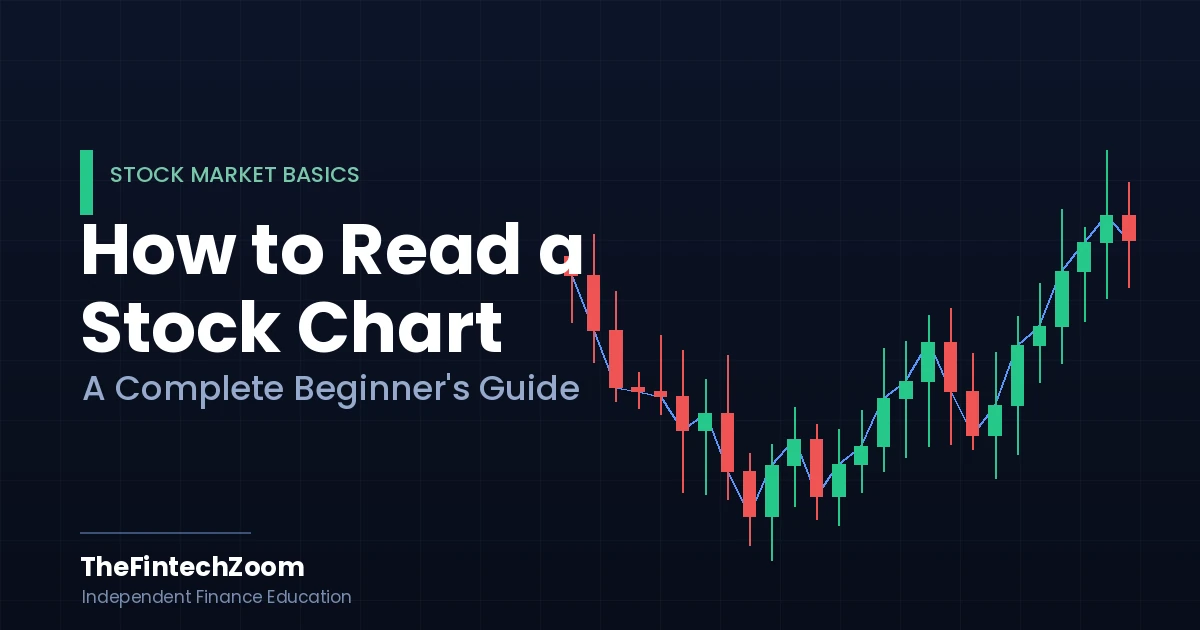
Candlesticks are worth understanding because they’re everywhere. A candle has a thick middle called the body and thin lines above and below called wicks (or shadows).
The body shows the distance between open and close. The wicks show how far price stretched before snapping back. A green (or white) candle means the stock closed higher than it opened. A red (or black) candle means it closed lower.
A useful detail: a long body means one side won decisively that period. A tiny body with long wicks means buyers and sellers fought hard and neither got anywhere. That indecision often shows up right before a stock changes direction.
Candlesticks aren’t new, by the way. Japanese rice traders were using them in the 1700s, and trader Steve Nison introduced them to Western markets in his 1991 book Japanese Candlestick Charting Techniques. The format has lasted because it packs four prices into one glance.
How Do You Read a Stock Chart Step by Step?
To read a stock chart, work from the big picture down to the detail. Start with the timeframe, then read the overall trend, mark the key price levels, check volume for confirmation, and only then look at indicators. Reading in that order stops you from getting fooled by a single dramatic candle.
Here’s the routine I’d hand a beginner on day one.
- Set a sensible timeframe: Pick the daily chart first, where each candle is one trading day. Daily charts cut out the minute-to-minute noise that wrecks new traders. Drop to shorter timeframes only once the daily picture makes sense.
- Read the trend before anything else: Zoom out. Is price generally rising, falling, or moving sideways? A series of higher highs and higher lows is an uptrend. Lower highs and lower lows is a downtrend. Flat and choppy is a range. The trend is your context for everything that follows.
- Mark support and resistance: Find the price areas where the stock keeps bouncing up (support) and where it keeps getting rejected (resistance). Draw a rough horizontal line at each. These levels show where buyers and sellers have repeatedly shown up.
- Check volume against the move: When price breaks a level or makes a strong move, glance at volume. Heavy volume backs the move up. Thin volume is a yellow flag that the move might not stick.
- Add one indicator, not five: A moving average is the natural first pick. It smooths price into a single line so you can see the trend without squinting. Resist the urge to stack ten indicators; they’ll just contradict each other.
- Put it together into a sentence: You should be able to say something plain, like: “This stock is in an uptrend, sitting just above support, with rising volume.” If you can say that, you can read the chart. That’s the goal.
The order is the point. Beginners tend to jump straight to indicators and patterns, then wonder why nothing lines up. Trend and levels first, decoration last.
How Do You Read Trends, Support, Resistance, and Volume?
Trend is the overall direction of price, support and resistance are the levels where price tends to stall and reverse, and volume measures the conviction behind a move. Reading them together tells you not just where a stock is going, but whether the move has real force behind it.
Trend is the single most important thing on the chart. The market has an old, blunt saying: the trend is your friend. In an uptrend, price stair-steps up, pulling back a little before pushing higher. In a downtrend, it stair-steps down. When you can’t tell which way it’s going, that’s a range, and ranges are where a lot of beginners lose money trying to force a direction that isn’t there.
Support is a floor. It’s a price area where the stock has dropped to and bounced from more than once, because buyers see value there and step in. Resistance is the ceiling, where sellers keep taking profits and pushing price back down.
These levels aren’t exact prices. They’re zones. A stock that bounced at $48, $49, and $47.50 has a support zone around $48, not a magic line at one decimal. Treat them as neighborhoods, not addresses.
One thing that surprises new chart readers: when a stock finally breaks through resistance, that old ceiling often becomes the new floor. The level flips roles. Watching for that flip is one of the more reliable habits you can build.
Volume is the lie detector. A breakout above resistance on heavy volume is the market voting with real money. The same breakout on weak volume is often a “false breakout” that fizzles and reverses, trapping anyone who chased it. Whenever you see a big price move, your reflex should be to look down at the volume bar before believing it.
Moving averages tie this together. A moving average plots the average closing price over a set number of days as a smooth line. The 50-day and 200-day averages are the two the whole market watches. When price holds above them, sentiment is generally healthy. When the 50-day crosses above the 200-day, traders call it a golden cross; the opposite is a death cross. You don’t need to trade on these, but you should recognize them, because a lot of other people are watching the same lines.
A grounded example helps. Picture a stock that’s been climbing for months, riding above its 50-day average. It pulls back, touches that average, and bounces on a spike of volume. That’s a textbook reading: uptrend intact, price respecting a known level, buyers showing up with conviction. No prediction required. You’re just reading what already happened and noticing the pattern.
What Are the Most Common Mistakes Beginners Make When Reading Charts?
The biggest beginner mistakes are treating charts as a crystal ball, overloading the screen with indicators, ignoring volume, and reading a single candle without its surrounding context. Most chart-reading failures trace back to one of these four habits, and all of them are fixable.
Mistake 1: Thinking charts predict the future: They don’t. A chart shows you probabilities and context, not certainties. Technical analysis tilts the odds; it never guarantees an outcome. Even experienced traders misread signals and chase false breakouts. If a guide promises a chart pattern that “always” works, close the tab.
Mistake 2: Drowning in indicators: New traders pile on RSI, MACD, Bollinger Bands, stochastics, and three moving averages, then freeze when the signals disagree, which they constantly do. Start with price, volume, and one moving average. Add complexity only when you understand why you need it.
Mistake 3: Ignoring volume: Price moves get all the attention, but volume tells you whether to trust them. A move without volume behind it is a rumor. Checking volume takes one second and filters out a huge share of bad signals.
Mistake 4: Reading one candle in isolation: A single scary red candle means little on its own. What matters is where it sits in the trend and near which levels. Context is everything. Zoom out before you react.
Mistake 5: Confusing the timeframe: A stock can look like it’s crashing on a 5-minute chart and trending up beautifully on the daily. Beginners panic-react to short timeframes that are mostly noise. Match the timeframe to how long you actually plan to hold.
There’s also a quieter myth worth killing: that you need to read charts to invest at all. You don’t. Plenty of successful long-term investors barely glance at a candlestick. Charts are a tool for timing and context, not a requirement for buying good companies. Use them as one input among several, alongside the actual business behind the ticker.
Frequently Asked Questions
How do beginners start reading stock charts?
Start with a daily candlestick chart of a company you know. Read the trend first, mark obvious support and resistance levels, then check volume. Add a single moving average for context. Practice describing each chart in one plain sentence before moving on.
Do I need indicators to read a stock chart?
No. You can read most of a chart’s story from price action, support and resistance, and volume alone. Indicators are optional helpers, not requirements. One moving average is plenty to begin with. Stacking many indicators usually creates conflicting signals and slows down your decisions.
What is the best chart type for beginners?
Candlestick charts are usually the best starting point. They show the open, high, low, and close in one visual shape, making momentum and indecision easy to spot. Line charts are simpler but hide too much. Most technical analysts settle on candlesticks for the same reason.
What do green and red candles mean?
A green (or white) candle means the stock closed higher than it opened during that period. A red (or black) candle means it closed lower. The body shows the open-to-close range, while the thin wicks show the highest and lowest prices reached before the close.
What timeframe should a beginner use?
The daily chart, where each candle represents one trading day, is the best starting timeframe. It filters out the minute-to-minute noise that confuses new traders. Shorter timeframes move faster and contain more false signals. Match your chart timeframe to how long you intend to hold the stock.
Can stock charts predict where a price will go?
No. Charts show probabilities and context based on past behavior, not certainties. Technical analysis can improve your odds and timing, but it cannot guarantee future prices. Any source promising patterns that always work is overselling. Treat charts as one input alongside the company’s actual fundamentals.
What is support and resistance in simple terms?
Support is a price area where a stock keeps stopping its fall and bouncing, because buyers step in. Resistance is where it keeps stalling and dropping back, because sellers take profits. Both are zones, not exact prices. When price breaks resistance, that level often becomes new support.
The Bottom Line
Learning how to read a stock chart sounds technical, but it comes down to a simple habit: read the trend, mark the levels, and confirm with volume, in that order. Everything else is detail you can add later.
Don’t try to master every pattern and indicator at once. Pull up a daily candlestick chart of a stock you follow, and practice saying one clear sentence about it: trend, level, volume. Do that a few dozen times and the chart stops looking like a heart monitor and starts reading like a story.
Your next step: open a free charting tool, pick one familiar stock, and run through the six-step routine above on today’s chart. Reading improves with reps, not theory.
This guide is for educational purposes only and is not financial advice. Always do your own research and consider speaking with a licensed financial professional before investing.